Navigating the Portal
Overview
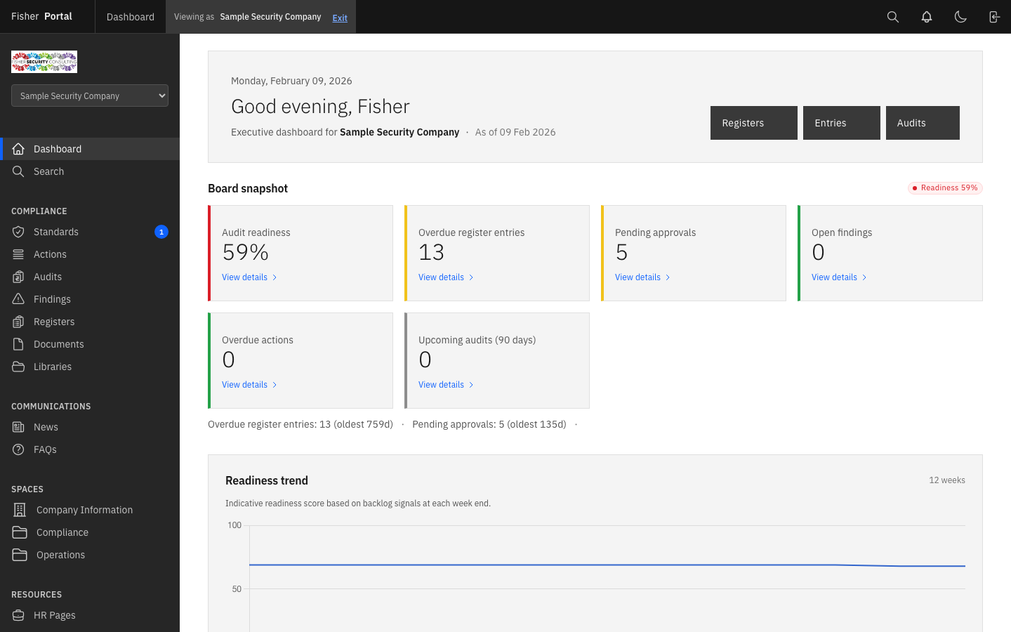
Fisher Portal uses the Carbon Design System layout with a fixed header bar at the top and a sidebar navigation panel on the left. This guide explains each navigation element and how to find your way around the portal, including on mobile devices.
The Header Bar
The header bar is the dark strip across the top of every page. It remains fixed as you scroll and provides quick access to global actions.

From left to right, the header contains:
| Element | Description |
|---|---|
| Hamburger menu (mobile only) | Opens the sidebar navigation on smaller screens |
| Fisher Portal | The platform name, which links back to the Dashboard |
| Page title | Shows the name of the current page (visible on larger screens) |
| Client switcher (Super Admins only) | A dropdown to switch between client contexts |
| Notification bell | Links to your notifications; shows a red badge when you have unread notifications |
| Theme toggle | Switches between light mode (moon icon) and dark mode (sun icon) |
| Sign out | Ends your session and returns you to the login page |
The Sidebar Navigation
The sidebar is the dark panel on the left-hand side of the screen. It displays navigation links organised into labelled sections.
Sidebar Sections
The sidebar links you see depend on your role. The sections below describe a typical layout.
Top section (all users):
- Dashboard — Your home page with overview metrics and quick actions
- Search — Global search across all content types
Admin section (Super Admins without a client context):
- Clients — Manage client organisations
- Template Registers — Manage master register templates
- Template Documents — Manage the document template library
Compliance section (when viewing a client):
- Registers — Compliance registers for the selected client
- Documents — Document library for the selected client
- Libraries — SharePoint-connected document libraries
Communications section (when viewing a client):
- News — News posts (with a badge showing recent post count)
- FAQs — Frequently asked questions
Spaces section (when viewing a client):
- Custom spaces configured by your organisation appear here
Resources section (when viewing a client):
- HR Pages — Human resources content
- Page Builder — Custom page management
Schedule section (when viewing a client):
- Events — Upcoming events (with a badge for upcoming count)
- Countdowns — Active countdown timers
People section (Client Admins and above):
- Staff Directory — Manage users within the organisation
Active Page Indicator
The currently active page is highlighted with a lighter background and a coloured vertical bar on the left edge. This makes it easy to see where you are at a glance.
Footer
At the bottom of the sidebar, your email address is displayed alongside your avatar initial, so you can always see which account you are signed in with.
Mobile Navigation
On screens narrower than 1024 pixels (tablets and phones), the sidebar is hidden by default to give you more screen space.
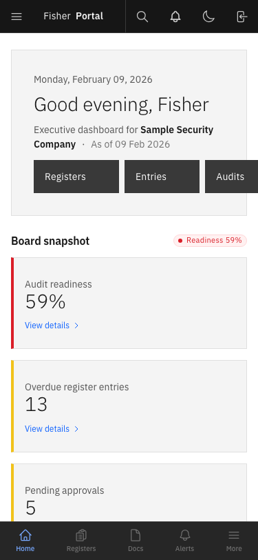
Step 1: Open the Mobile Menu
Tap the hamburger menu icon (three horizontal lines) in the top-left corner of the header bar.
Step 2: Browse the Navigation
The sidebar slides in from the left, overlaying the main content. A semi-transparent overlay appears behind it.
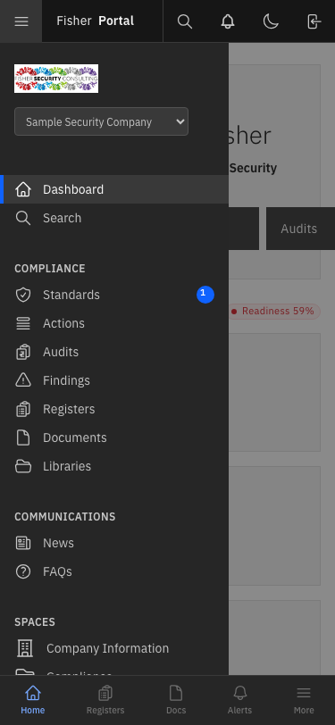
Step 3: Navigate or Close
- Tap any link to navigate to that page (the sidebar closes automatically).
- Tap the overlay area (the darkened area to the right of the sidebar) to close the menu without navigating.
Global Search
Fisher Portal includes a powerful global search that lets you find content across registers, documents, news, FAQs, events, and more.
Step 1: Open the Search Page
Click Search in the sidebar navigation. The search page displays a large search bar with an “Advanced Filters” toggle and a Search button.
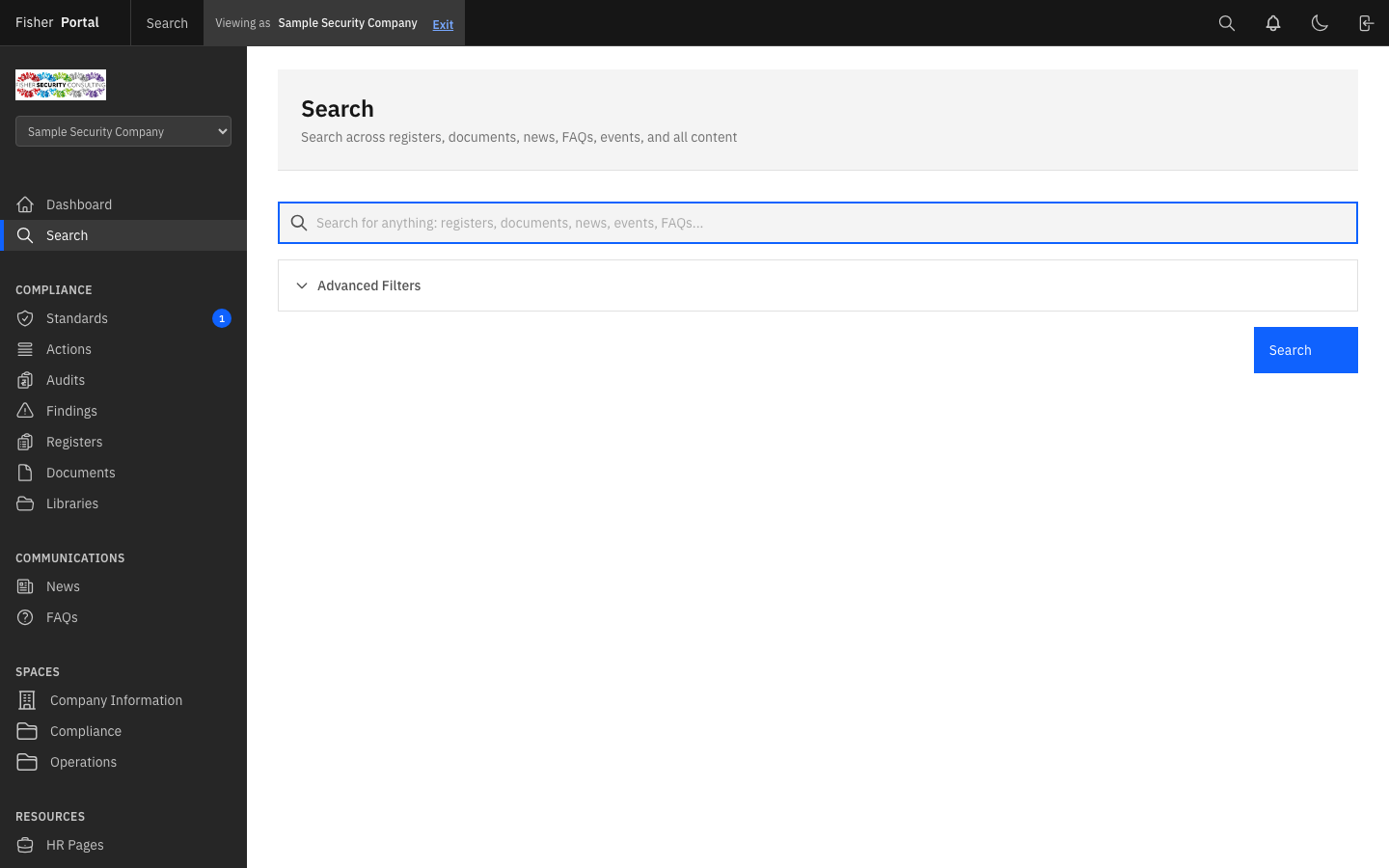
Step 2: Enter Your Search Query
Type your search term into the search bar. For example, type policy to find all policy-related content.
Step 3: Review Results
Click Search or press Enter. Results are grouped by content type (Documents, Registers, News, etc.) with a count for each group.

Each result shows:
- The item name (with matching search terms highlighted)
- The content type (e.g. “Template document”)
- The date and file size where applicable
- A chevron arrow to navigate to the full item
Step 4: Use Advanced Filters (Optional)
Click Advanced Filters to expand additional filter options:
- Type — Filter by content type (Registers, Documents, Entries, News, FAQs, Events, etc.)
- Status — Filter by status (Draft, Submitted, Approved, Rejected)
- Date From — Filter by date range
Step 5: Save a Search (Optional)
After performing a search, a Save Search button appears. Click it to save the current query and filters for quick access later. Saved searches appear as tags at the top of the search page.
Tips
- Keyboard navigation: All interactive elements support keyboard focus. Use Tab to move between elements and Enter to activate them.
- Breadcrumbs: Many pages include breadcrumbs below the header to show your location within the portal hierarchy.
- Browser back button: The portal supports standard browser navigation. Use the back button to return to the previous page.
- Bookmarks: You can bookmark any page within the portal for quick access.
Troubleshooting
| Problem | Solution |
|---|---|
| Sidebar not visible on desktop | Ensure your browser window is at least 1024 pixels wide. On narrower screens, use the hamburger menu. |
| Mobile menu does not open | Try refreshing the page. Ensure JavaScript is enabled in your browser. |
| Search returns no results | Try broadening your search term. Remove any active filters. Ensure you have access to the content you are searching for. |
| Notification badge not updating | Refresh the page to see the latest notification count. |