Your Profile and Preferences
Overview
Fisher Portal allows you to personalise your experience by switching between light and dark mode. Your theme preference is saved to your account and persists across sessions and devices, so you always see the portal the way you like it.
Dark Mode
Dark mode uses a darker colour palette that reduces eye strain, particularly in low-light environments. It is popular with users who spend long periods working in the portal.
Step 1: Locate the Theme Toggle
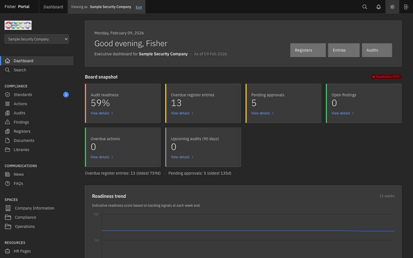
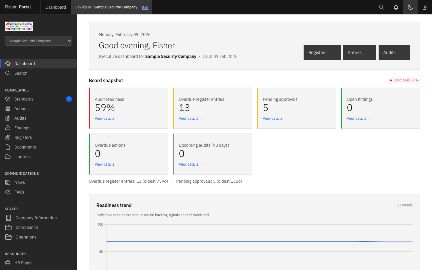
In the header bar at the top-right of the screen, find the theme toggle button. It shows either:
- A moon icon when you are currently in light mode (click to switch to dark mode)
- A sun icon when you are currently in dark mode (click to switch to light mode)
Step 2: Switch to Dark Mode
Click the moon icon in the header bar. The portal immediately switches to dark mode.
In dark mode:
- The main content area uses dark backgrounds with light text
- Cards and panels use subtly lighter shades for visual hierarchy
- The sidebar and header remain in their standard dark Carbon Design System colours
- The theme toggle icon changes to a sun icon
Step 3: Switch Back to Light Mode
Click the sun icon in the header bar to return to light mode.
In light mode:
- The main content area uses white and light grey backgrounds
- Text appears in dark colours for maximum readability
- The theme toggle icon changes to a moon icon
Theme Persistence
Your theme preference is saved automatically to your account. You do not need to do anything extra — just toggle the theme and it will be remembered.
How It Works
When you toggle the theme, Fisher Portal:
- Updates the page appearance instantly
- Saves your preference to the server
- Applies the same preference when you sign in from any device or browser
Verifying Persistence
To confirm your theme preference has been saved:
- Switch to your preferred theme (e.g. dark mode).
- Navigate to a different page or refresh the page.
The theme remains consistent as you navigate between pages. If you sign out and sign back in, your chosen theme will be applied automatically.
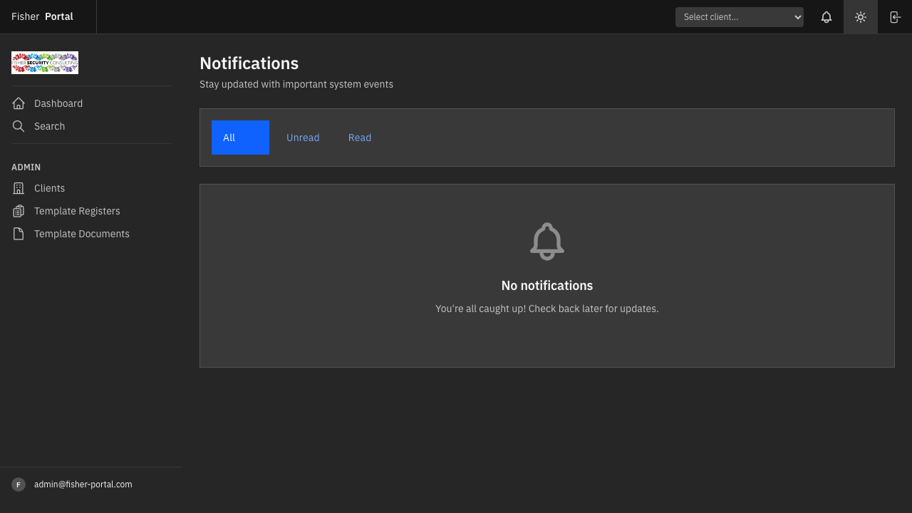
Notification Preferences
Notifications keep you informed about important events such as register entry approvals, document uploads, and system announcements. See the Notifications guide for full details on managing your notifications.
Currently, notifications are managed from the Notifications page. In-app notification preferences (such as choosing which types of notifications you receive) will be available in a future update.
Tips
- Dark mode for evening work: If you frequently work in the portal during evening hours, dark mode can reduce eye strain significantly.
- Consistency across devices: Because your preference is stored on the server, you will see the same theme whether you are on your desktop, laptop, or mobile device.
- Client branding compatibility: Both light and dark modes work with your organisation’s custom branding colours, if configured.
Troubleshooting
| Problem | Solution |
|---|---|
| Theme does not change when I click the toggle | Ensure JavaScript is enabled in your browser. Try refreshing the page. |
| Theme resets after signing out | This should not happen — your preference is saved to your account. If it persists, contact your administrator. |
| Colours look unusual in dark mode | Some custom client branding colours may appear differently in dark mode. Contact your administrator to adjust branding settings. |
| Toggle button not visible | The theme toggle is in the header bar to the left of the sign-out button. On very narrow screens, it may be positioned near the edge. |